
by fcrisp3 | Apr 13, 2018
CORPORATE ID NetWerks A local IT consulting company needed a refresh of their brand. The new look embodies the complexities of analyzing their clients technologies and helping them navigate the...

by fcrisp3 | Apr 12, 2018
CORPORATE ID Ray High-Efficiency Boilers This logo was crafted to live up to the product’s name and the positive affect its eco-conscious technology was expected to have on both the environment and industry. The bright yellow was also a welcome, consumer friendly look...

by fcrisp3 | Apr 12, 2018
CORPORATE ID Colony Hills Capital The key to this mark is a contemporary take on business’s key investment assets: multifamily apartment properties. For an industry where most brands adopt a financial institution look and feel, this was a way to help differentiate the...

by fcrisp3 | Apr 11, 2018
CORPORATE ID AFcell The natural choice for a company with cellular-based therapies was to play of the natural division of human cells. The red was no accident either, as it signified something unique to the industry—like the color itself among the industry’s typical...
by fcrisp3 | Apr 11, 2018
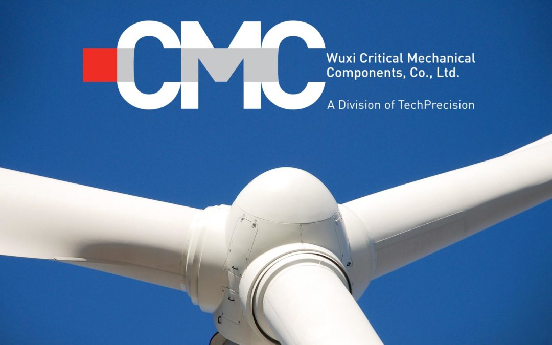
CORPORATE ID CMC – Wuxi Critical Mechanical Components] This company’s mark was designed to feel as substantial as the massive mechanical components it manufactures. The pop of red is a subtle nod to the company’s location (Wuxi China) and to its prized forge, which...

Recent Comments